Review
Redesign of the statistical and geographic information portal Infogel. This redesign needed to be based on UX research that reveals user needs.
Problem
Although traffic stats show a steady increase in users, they also indicate low interaction, which negatively affects retention.
Consulting objectives
Evaluate the usability of the portal • Identify user needs and expectations • Define a logical and effective information structure • Gather feedback to improve the platform's interface and functionality.
Hypothesis
The user finds the site interesting but leaves quickly because the navigation is confusing, and they don't know how to interpret the statistical and territorial information.
Who is the website for?
Community leaders • Local officials and authorities • Public and private sector professionals
My role
In the project, I worked as a consultant, acting as a Product Designer. I formed a UX team and collaborated with the client at every stage of the projectresearch • ideation • UI • prototyping • Testing
Metodología
We decided to use the UCD (User-Centered Design) methodology to focus on user needs and issues.
Results
After the first 3 months of launching the redesigned site, the time per session increased from 4 min and 14s to 11 min and 35s with an average of 2.2 page views per session. On the other hand, the indicators of new visitors and recurrence were maintained. So, we can conclude that the goal of increasing engagement was achieved, but the flow of new users and retention remained constant
Research
Investigation design
The research consists of three parts: 1) Contextual attitude, focused on identifying needs, pain points, and user profiling; 2) Information organization, aimed at validating a new navigation menu; 3) Usability, focused on validating the prototype with the new design and navigation proposal.
Script
With the research plan in place, we then developed an intervention guide to ensure that the 2 consultants conducting the interviews could do so consistently, thus ensuring no loss of information.
Interviews
We allocated a specific day for each location and coordinated the time and place with each participant. For those who couldn't make it on the scheduled date for their district or needed to reschedule the interview, they were offered the option to conduct it virtually on a later day. In total, 15 interviews were conducted.
Systematize data
The information gathered from the interviews was entered into a knowledge base for classification and analysis. Pain points were identified, user personas were formulated, and an empathy map was created to visualize a significant contradiction between what users say and do. Finally, a quantitative analysis of recurring mentions was conducted to identify priorities. The Dovetail platform was used for this analysis
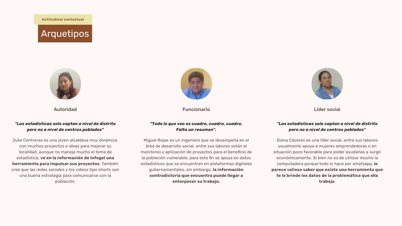
User personas
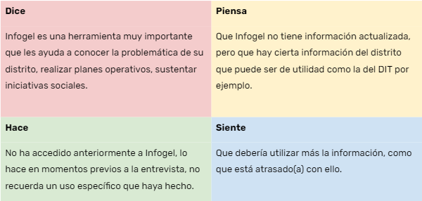
Empathy map
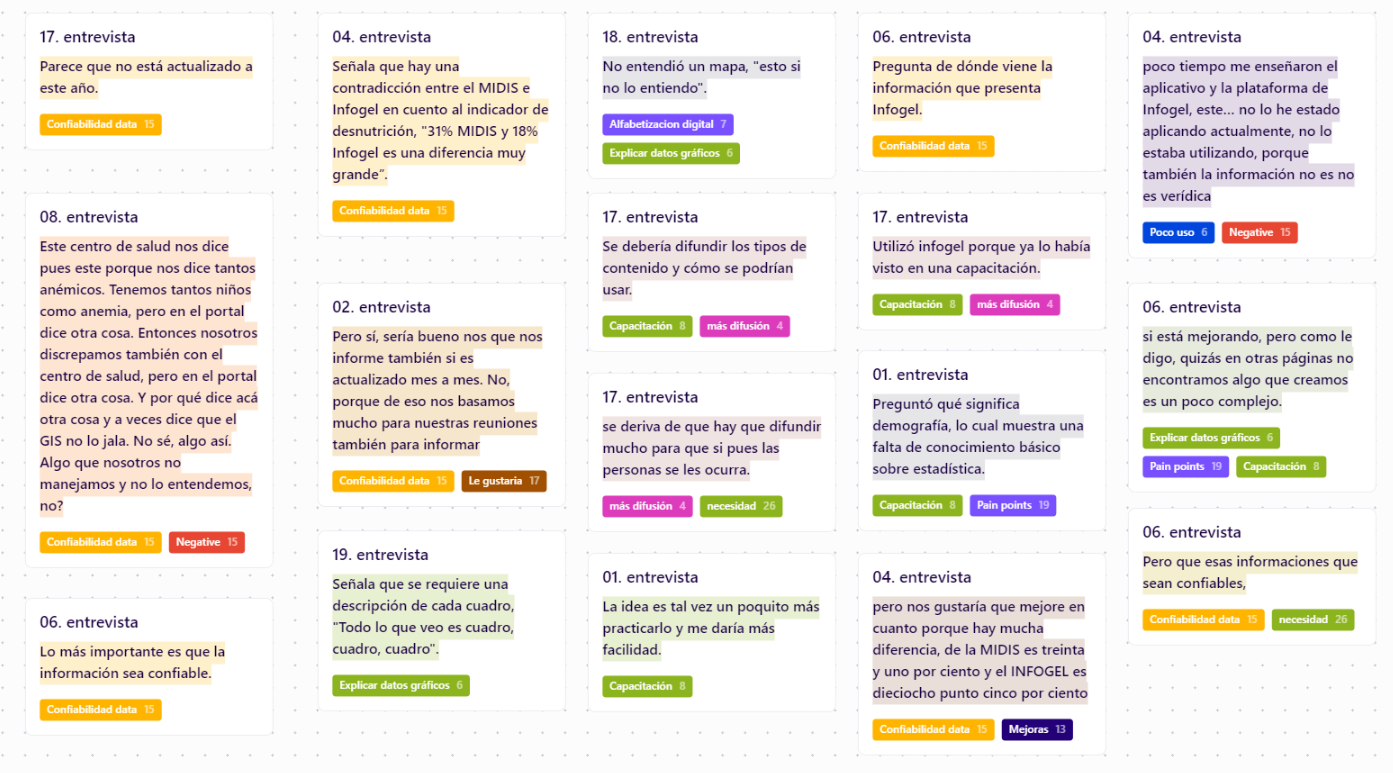
Clasificación
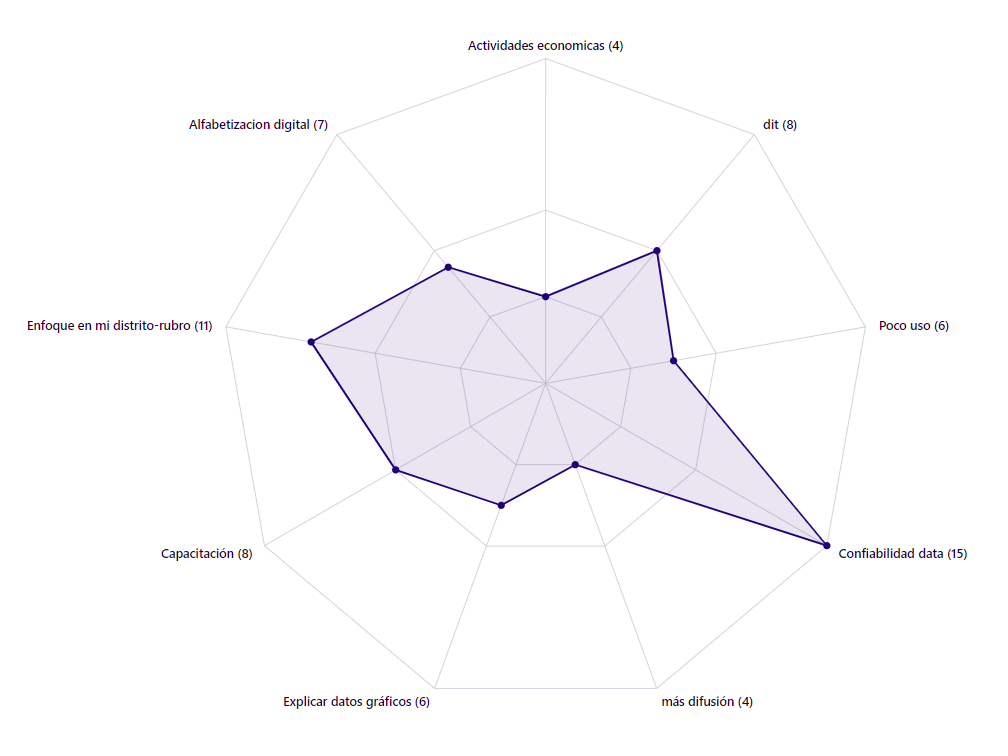
Trends
Specify
With clear project objectives and having analyzed both the website and the users, we moved on to the next stage of the methodology, which is generating solution ideas based on the findings and assigning them priority.
Design
Site map
We simplified the content structure to clarify navigation and make it easier to reach any part of the site.
UI
We designed master pages (home, district, indicators, general) for both desktop and mobile versions. For the mobile design, we considered the smallest size for Android phones (360px width) to ensure good visibility even on devices with smaller screens. Tablet design wasn't specified because it's simply a scaling of the desktop design with no element rearrangement, and statistics show no visits from tablets.
Style guide
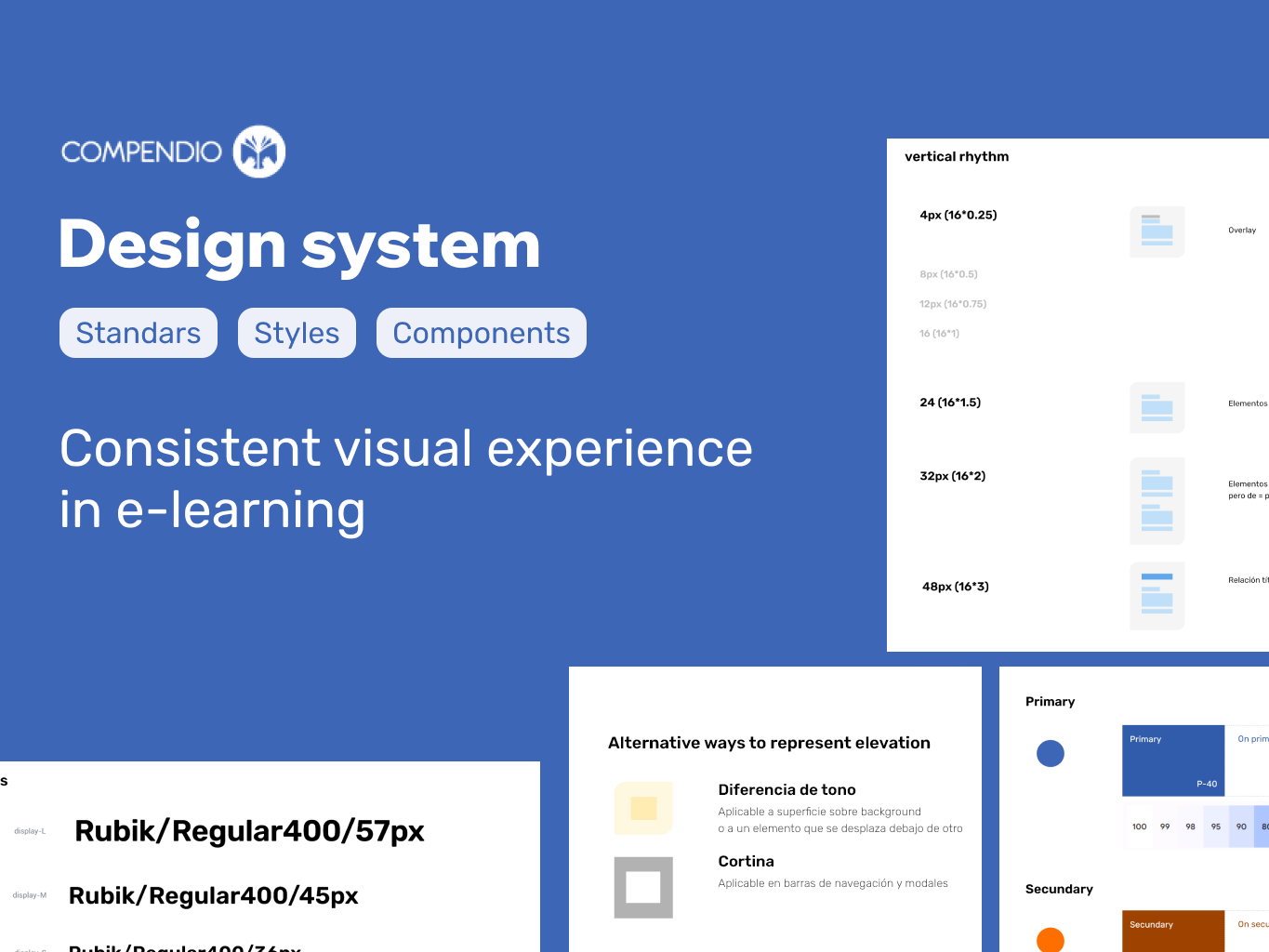
We established a set of guidelines and visual components to ensure consistency in the appearance and user experience on the Infogel website. This is crucial for maintaining visual consistency as the site scales and expands, allowing for efficient creation of new sections and pages by following a predefined set of rules.
Testing
Test menu
We used card sorting to check if there's a match between the proposed menu and how users classify the content.
The following graph shows a strong match between the proposal and the classification done by users in the test.
Usability test
We conducted a comparative usability test between the current website and the prototype to measure if the prototype indeed improves usability.
The process involved giving users 3 tasks to complete in both environments (current website and prototype). The results showed a higher effectiveness rate in the prototype (73.33%) compared to (10.42%) of the website.
Maze platform was used for this evaluation.
Iteration
We made changes to the prototype based on the information gathered in the usability test.
Hand off
We provided the team, especially the developers responsible for implementing the improvements, with a 'handoff' document containing final designs, interactive prototype, design specifications, styles, and graphic assets to ensure implementation as close as possible to the design.
Client testimonial
"Thank you very much, Roy, for the work you've done. This will help us a lot in redesigning our platform based on the needs of our end users. It's been great working with you!"
Next steps
Implement the prototype • communicate the new design • create a roadmap for future improvements • continuously promote the enhancements.
Lessons learned
It's important to understand the background and technology behind the digital product you're going to work on. This helps not only to have a better knowledge base but also to avoid exploring paths already taken or proposing solutions that are difficult to implement.
Update
Later, the client commissioned me to implement the website for which I used low code technology (WIX).

